Reserve
Brand design, illustration and digital experiences

At Reserve, I worked on the identity and communication of financial products, from a dollar app for Latin America to onchain index funds. As senior brand designer, I developed visual direction proposals with the design and marketing teams to explain each product and give it a distinct identity within the brand. I began working with Reserve as an illustrator and Instagram lead for Latin America.
- Company
- Reserve
- Teams
- Design and marketing
- Deliverables
- Illustration system
- Social media assets
- Web visuals
- Merch
- Animation
- Content strategy and creation
Brand and digital products
2025–2026
Reserve.org and Consensus Hong Kong
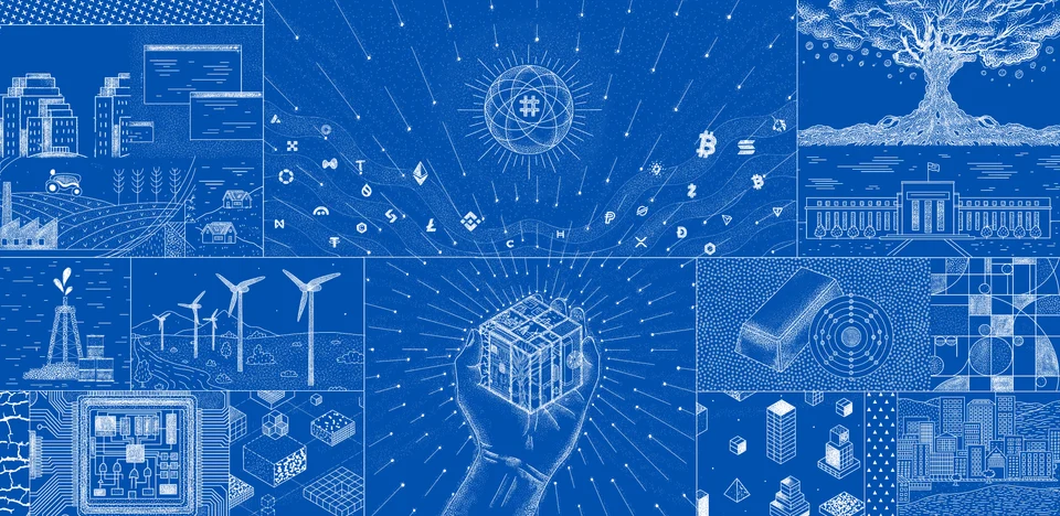
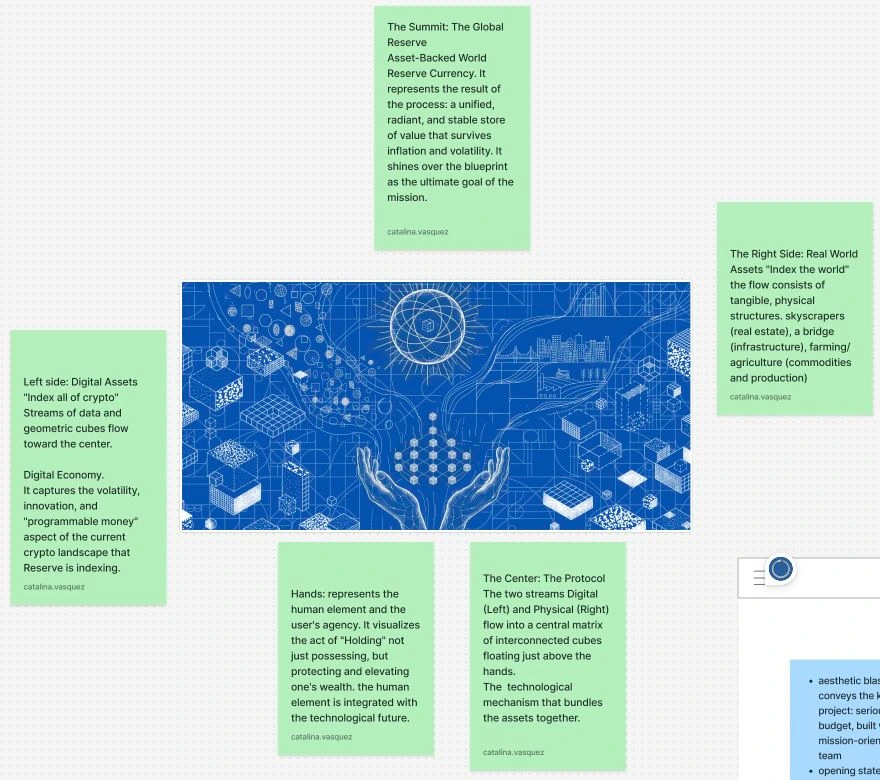
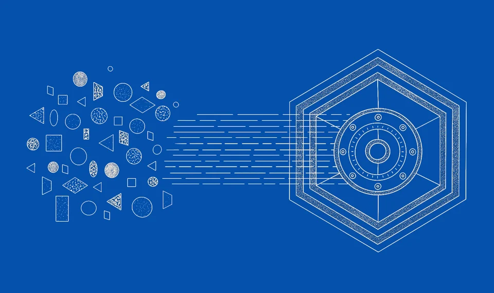
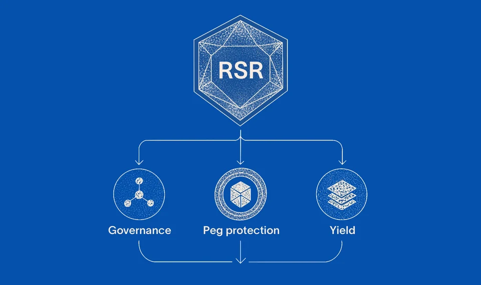
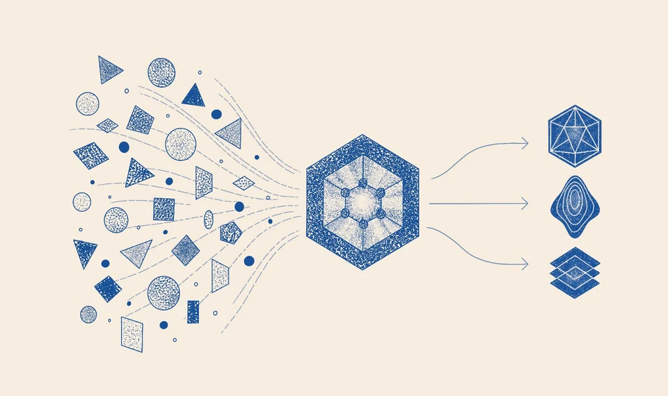
For Reserve.org, the illustration needed to explain how different sources of wealth could be brought together in one digital asset. I organised the image to connect the digital economy with physical assets, using hands to represent the ability to manage and protect wealth. The illustration was later adapted for Reserve’s booth at Consensus Hong Kong.
More applications
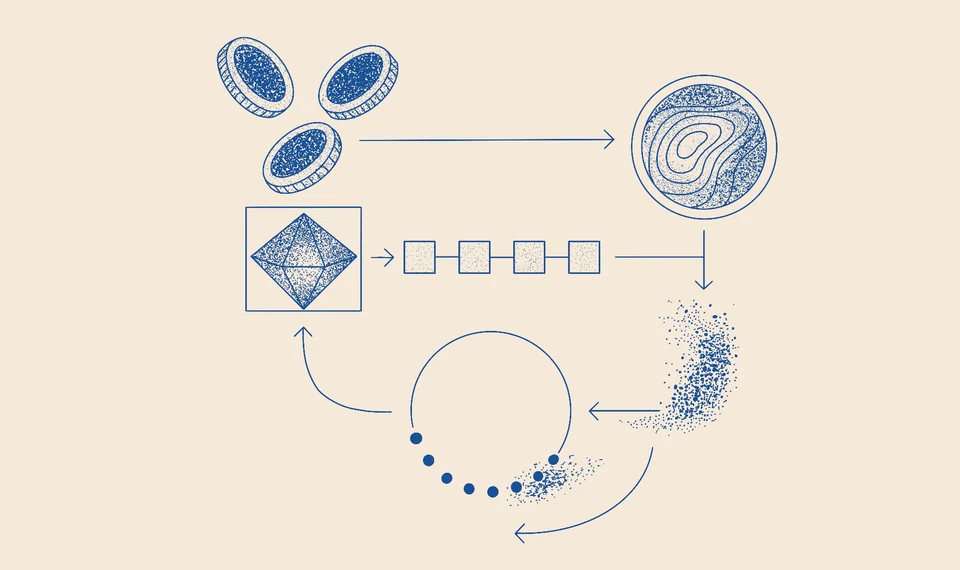
I developed the composition alongside the homepage structure. The position of the headline and the paths of the connecting lines determined how the scenes were read together. I reviewed those relationships with the design team, working within Reserve’s existing visual language.


MAG7
Visual proposal for Reserve’s MAG7 fund.
MAG7 · Visual proposal
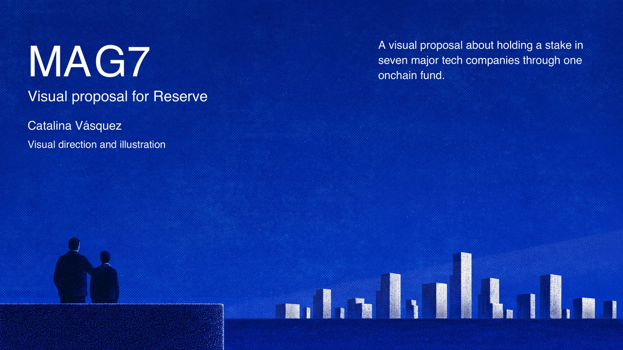
Visual proposal for Reserve’s MAG7 fund.
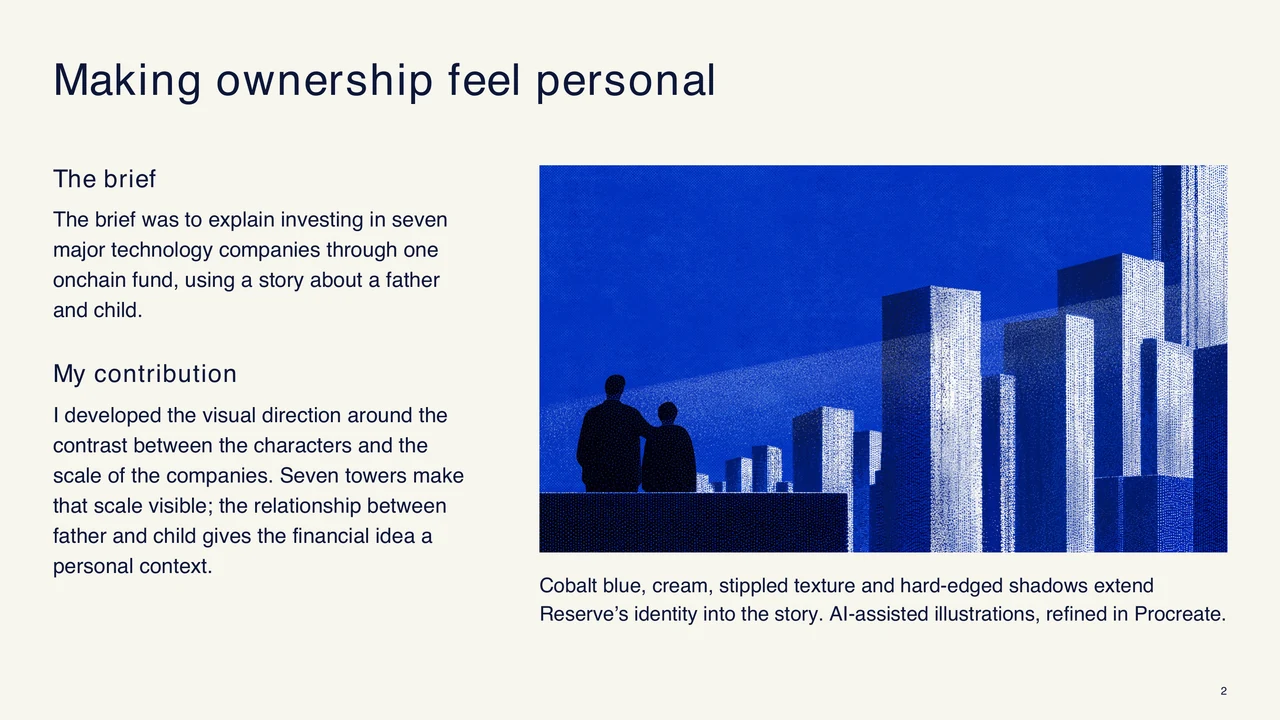
The brief was to explain investing in seven major technology companies through one onchain fund, using a story about a father and child.
I defined a visual direction that contrasted the intimacy of the characters with the scale of the companies. Cobalt blue, cream and stippled textures kept the proposal within Reserve’s visual language.
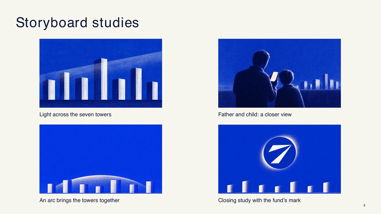
Light across the seven towers
Father and child: a closer view
An arc brings the towers together
Revised direction · closing composition study
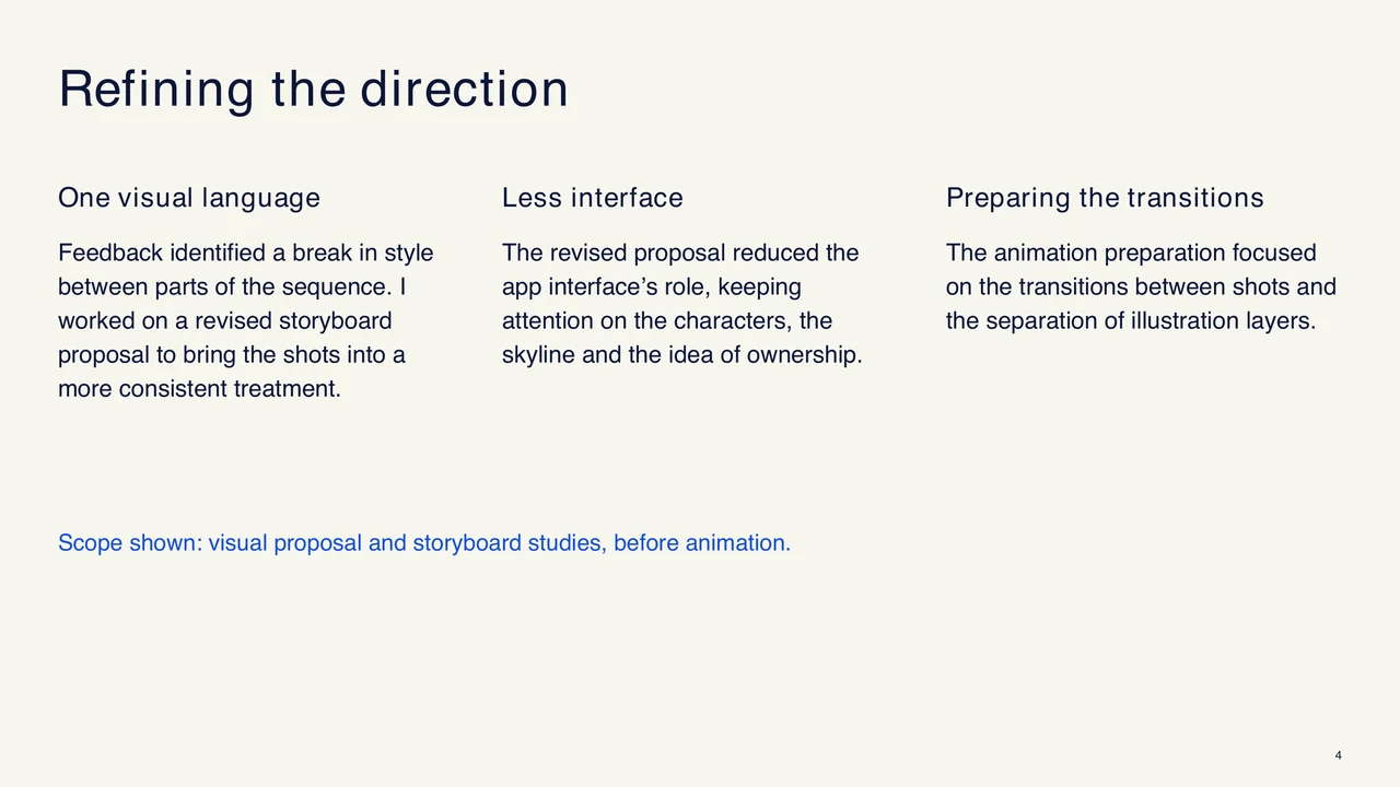
The first review showed that the scenes needed greater visual consistency. I focused the sequence on the characters and skyline, giving the phone interface a smaller role. The animation preparation focused on the transitions between shots and the separation of illustration layers.
Visual proposal and storyboard studies, before animation.
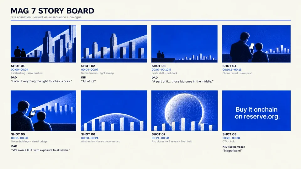
Visual direction, illustration and storyboard: Catalina Vásquez. Concept and script: Rino Arreaza. Animation preparation with Rino Arreaza and Tzu Lin. AI-assisted images, retouched in Procreate.
The Network Fund
I designed the visual concept and web prototype to explain The Network Fund, a proposed fund based on analysts’ social-media signals. I structured the experience to follow those signals through to the portfolio’s assets, using animated flows and a holdings map sized by weight. Unlaunched prototype with sample data.
Working with the team, I organised the information to distinguish analysts’ opinions from their buy or sell signals. Each signal links to its source and shows how it relates to the fund’s holdings.
Prototyped with Claude, Claude Design and Codex.
Campaigns and motion
Motion and interaction
2025–2026
AI-sector DTFs
For the launch of five AI-infrastructure funds, I used illustration and animation to explain the companies held in each fund and their role in the technology supply chain: chips, energy, optical networks, data centres and robotics.
PHOTON logo: Tzu Lin. Animation: Catalina Vásquez.
Make a move
For the launch of LCAP, Reserve’s fund of large-cap cryptoassets such as BTC, ETH and SOL, I combined frame-by-frame animation, rotoscoping and motion tracking to integrate animation with the filmed footage.
Animation and motion design: Catalina Vásquez.
Film production: Rino Arreaza and Rodolfo Castillo.
Design studies
I explored names and logos to give Reserve’s family of funds a coherent identity and distinguish each investment proposition. I also worked on a shared structure for explaining what each fund offers and how it works.
Quality & Dilution
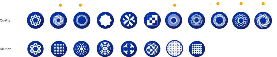
Initial logo studies by Catalina Vásquez and Tzu Lin, based on strategies defined by Reserve’s research team.
AI-sector DTFs
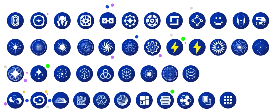
AI-sector logo exploration: Catalina Vásquez and Tzu Lin.
NEOCLOUD · Final logo developed from the shared exploration.
Initial design: Catalina Vásquez.
Final colours: Tzu Lin.
CMC20
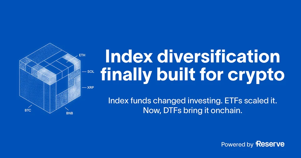
CoinMarketCap × Reserve · 2025For the CMC20 launch, I designed web and social assets to communicate its approach to diversification: twenty cryptoassets held in a single onchain fund.

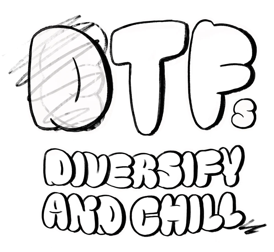
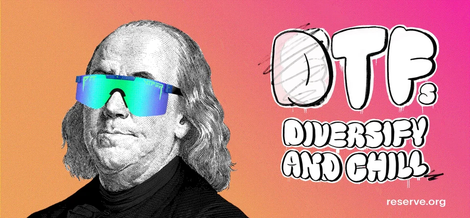
Diversify and Chill
Lettering for Reserve’s Diversify and Chill campaign, displayed on a billboard during ETHDenver 2025.
Community work · 2021–2023
Community and physical work
2021–2023
Homepage illustrations
For the 2021 homepage, I approached saving through situations familiar to Reserve’s Latin American audience. Scenes of people, places and everyday exchanges connected the product to their daily lives.
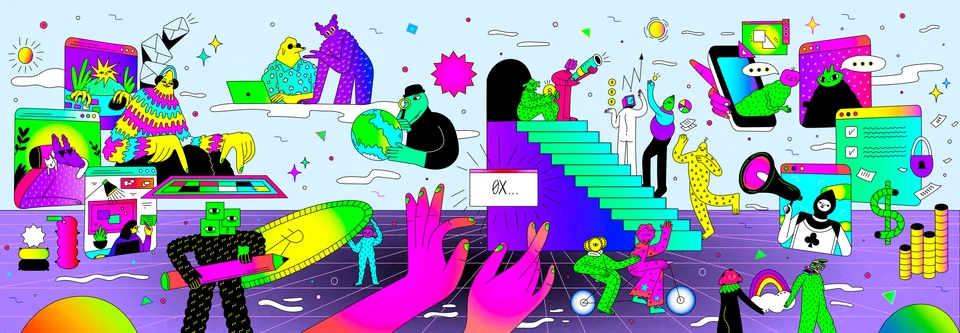
Featured in Best of Behance and GraphicMama’s Graphic Design Trends 2023.
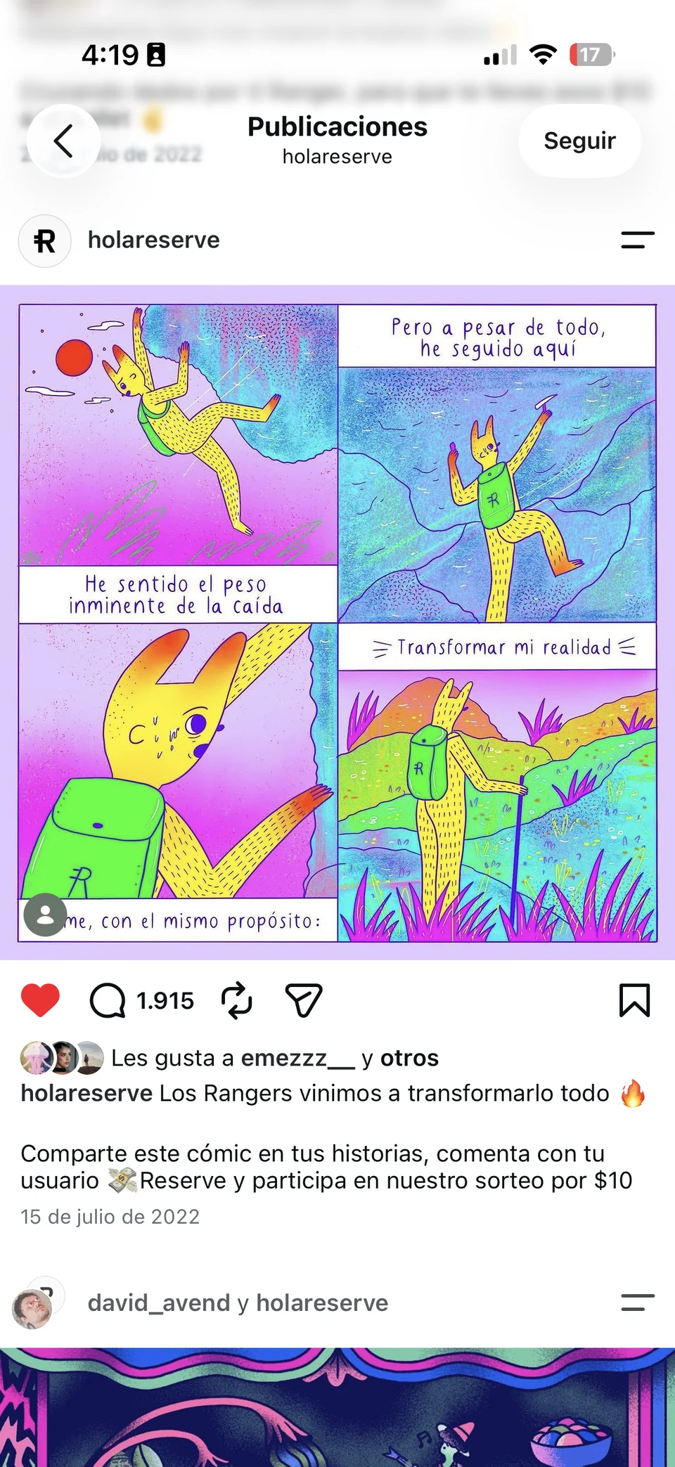
Instagram, @holareserve
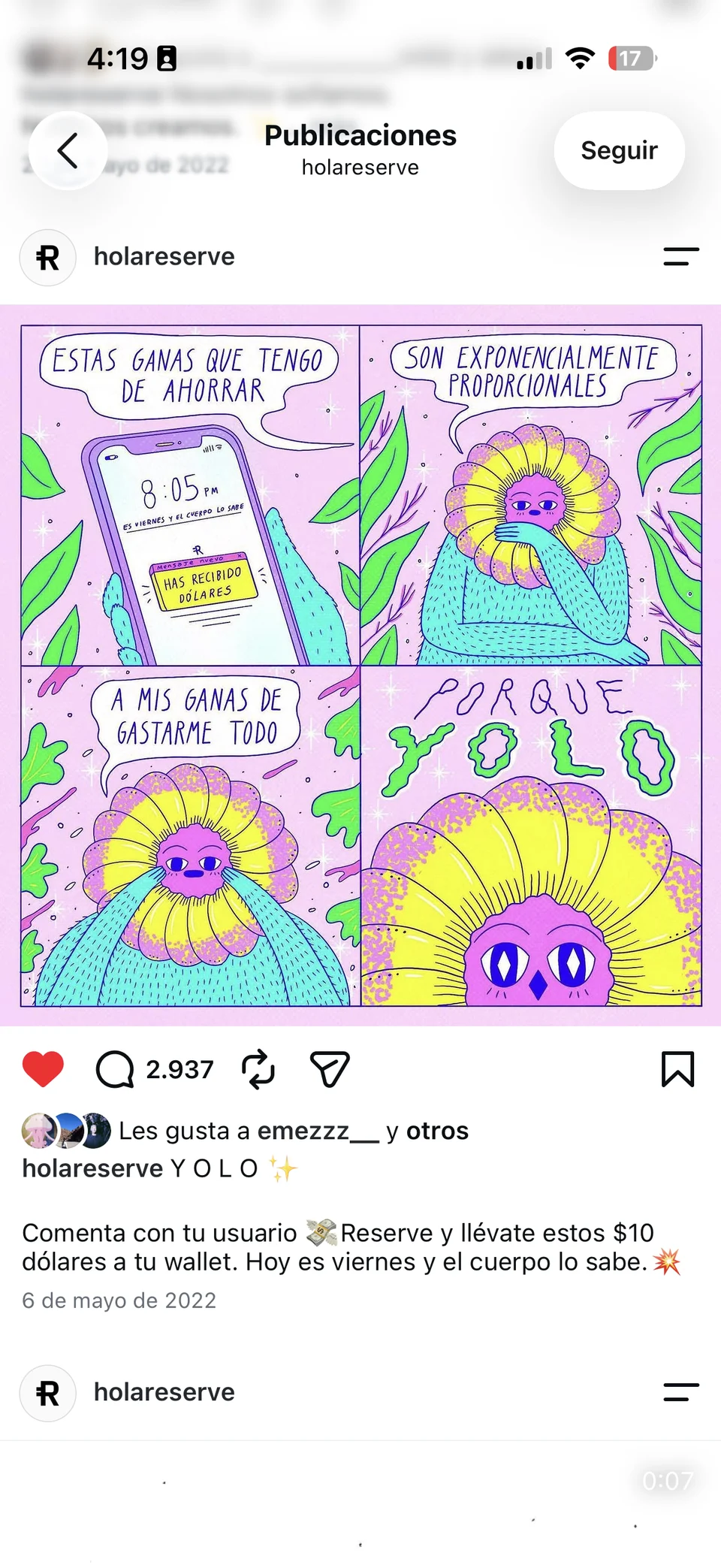
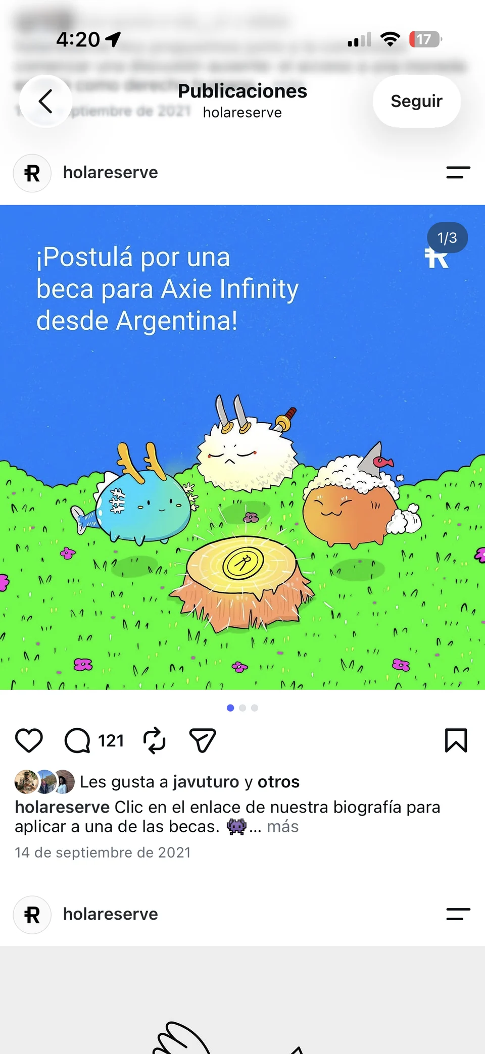
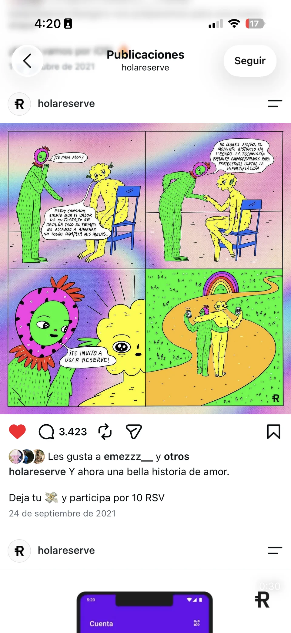
For @holareserve, I developed illustrations and content that combined product information with the humour and references of its Latin American community.
2021–2023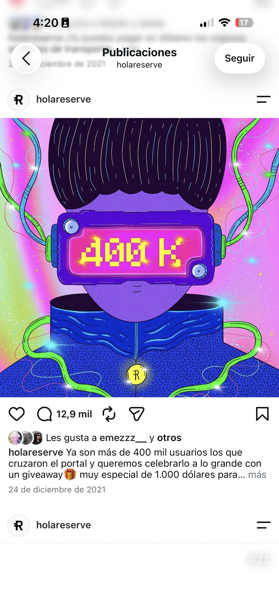
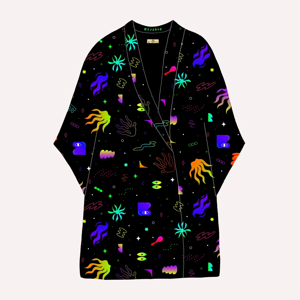
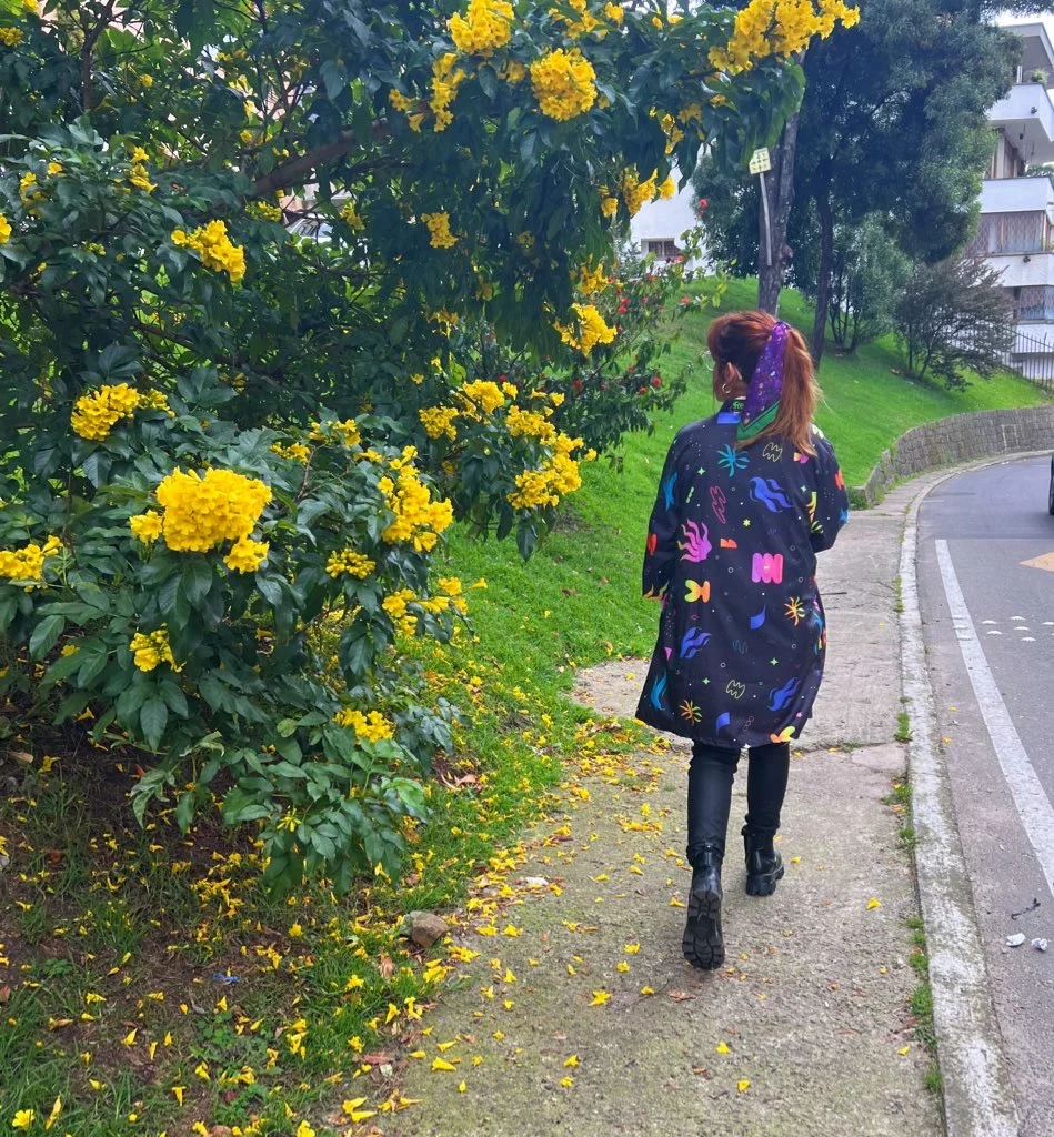
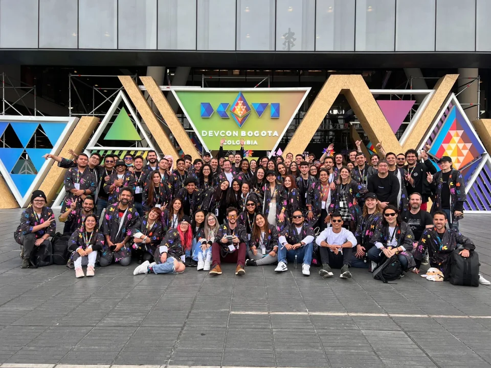
Reserve Kimono
For Devcon Bogotá 2022, I adapted Reserve’s illustration to a kimono for its community. I adjusted the scale and placement of the drawing to suit the garment’s proportions.